A React UI component library and design system for clean application interfaces
Components
Explore Frost UI components
in Storybook.
Design Foundations
The foundational design elements that define the visual language of Frost UI. These are used throughout the components above. More detailed documentation is in progress.
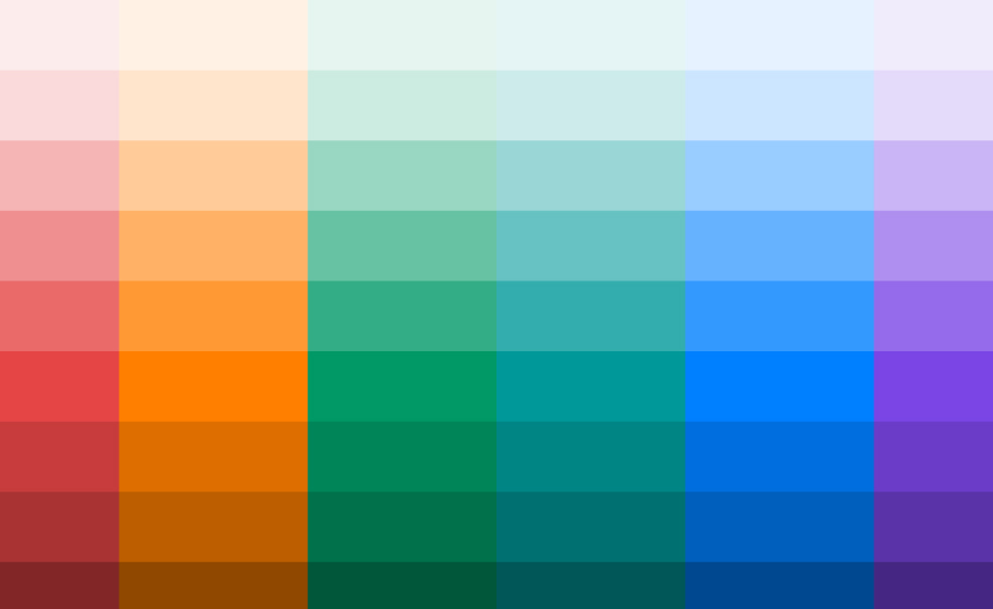
Colors
Base palettes, neutrals, and semantic roles for surfaces, text and states.
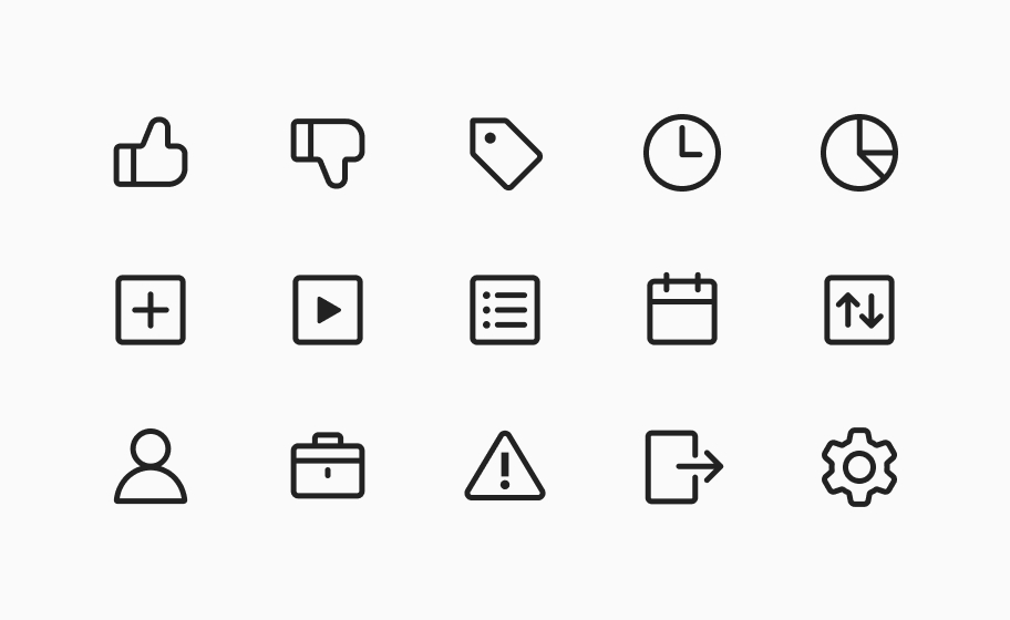
Icons
A custom Frost UI icon set is in development.
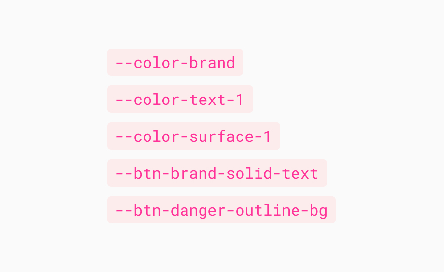
Tokens
A set of CSS variables for color, type, size and spacing across the system and its components.
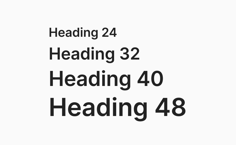
Typography
Typeface definitions for various text content such as heading, body, UI labels.
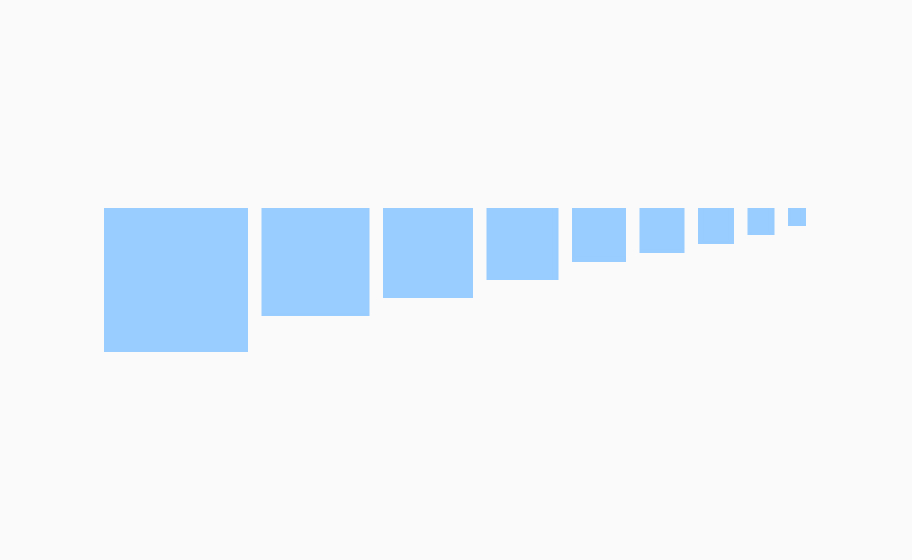
Size & Spacing
The spacing and size scale used for padding, gaps, sizing across components.
Frost UI focuses on calm, minimal and consistent interface design.
It aims to stay lightweight and unobtrusive, offering structure without becoming overly opinionated or visually loud. The system provides components that feel cohesive out of the box, while still leaving space for product-specific styling, branding and layout decisions.